How Can We Help?
The Image Module
How To Add A Image Module To Your Page
Before you can add a image module to your page, you will first need to jump into the Divi Builder. Once the Divi Theme has been installed on your website, you will notice a Use Divi Builder button above the post editor every time you are building a new page. Clicking this button will enable the Divi Builder, giving you access to all of the Divi Builder’s modules. Next, click the Use Visual Builder button to launch the builder in Visual Mode. You can also click the Use Visual Builder button when browsing your website on the front end if you are logged in to your WordPress Dashboard.
Once you have entered the Visual Builder, you can click the gray plus button to add a new module to your page. New modules can only be added inside of Rows. If you are starting a new page, don’t forget to add a row to your page first. We have some great tutorials about how to use Divi’s row and section elements.
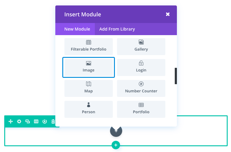
Locate the image module within the list of modules and click it to add it to your page. The module list is searchable, which means you can also type the word “image” and then click enter to automatically find and add the image module! Once the module has been added, you will be greeted with the module’s list of options. These options are separated into three main groups: Content, Design and Advanced.
Image Content Options
Within the content tab you will find all of the module’s content elements, such as text, images and icons. Anything that controls what appears in your module will always be found within this tab.
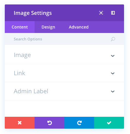
Image URL
Place a valid image url here, or choose/upload an image via the WordPress Media Library. Images will always appeared left justified within their columns and will span the full width of your column. However, your image will never scale larger than its original upload size. The height of the image is determined by aspect ratio of your original image.
Open In Lightbox
Here you can choose whether or not your image will open in a Lightbox when clicked. If enabled, then your image will “zoom in” to their full size when clicked inside a modal window. This is a great feature for portfolios.
Link URL
Place a valid web URL in this field to turn your Image into a link. Leaving this field blank will simply leave your image as a static element.
URL Opens
Here you can choose whether or not your link opens in a new window.
Admin Label
This will change the label of the module in the builder for easy identification. When using WireFrame view in the Visual Builder, these labels will appear within the module block in the Divi Builder interface.
Image Design Options
Within the design tab you will find all of the module’s styling options, such as fonts, colors, sizing and spacing. This is the tab you will use to change how your module looks. Every Divi module has a long list of design settings that you can use to change just about anything.
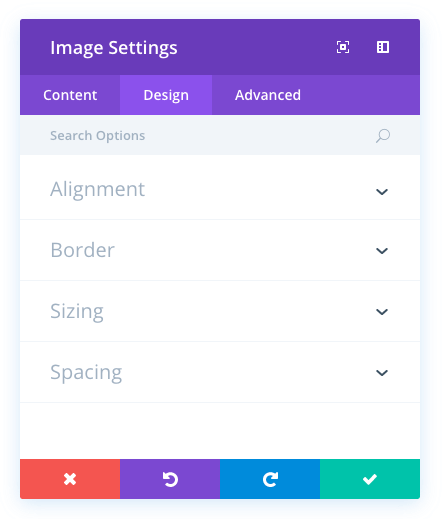
Image Overlay
If enabled, an overlay color and icon will be displayed when a visitors hovers over the image.
Overlay Icon Color
Here you can define a custom color for the overlay icon
Hover Overlay Color
Here you can define a custom color for the overlay.
Hover Icon Picker
Here you can define a custom icon for the overlay.
Remove Space Below The Image
This option only affects images when they are the last module in a column. When enabled, the distance between the bottom of the image and the following section is removed, allowing the image to border the top of the next section on the page.
Image Alignment
Here you choose which direction your image floats within the column. You can float the image left, right or keep it centered.
Always Center Image On Mobile
Often times small images are more pleasing to the eye on mobile devices when they are centered. As columns break down, images that were aligned the left or right in smaller columns become orphaned when the columns break down and become 100% width. Enabling this column with force images to align to the center of the column on mobile without affecting the image alignment on desktop computers.
Use Border
Enabling this option will place a border around your module. This border can be customized using the following conditional settings.
Border Color
This option affects the color of your border. Select a custom color from the color picker to apply it to your border.
Border Width
By default, borders have a width of 1 pixel. You can increase this value by dragging the range slider or by inputting a custom value into the input field to the right of the slider. Custom units of measurements of supported, which means you can change the default unit from “px” to something else, such as em, vh, vw etc.
Border Style
Borders support eight different styles, including: solid, dotted, dashed, double, groove, ridge, inset and outset. Select your desired style from the dropdown menu to apply it to your border.
Image Max Width
By default, image max width is set to 100%. This means that the image will be displayed at its natural width unless the width of the image exceeds the width of the parent column, in which case the image will be limited to 100% of the width of the column. If you would like to further restrict the max width of the image, you can do so by entering your desired max width value here. For example, a value of 50% would limit the width of the image to 50% of the width of the parent column.
Force Fullwidth
By default, images are displayed at their native width. However, you can choose to force the image to extend the full width of the parent column by enabling this option.
Custom Margin
Margin is the space added outside of your module, between the module and the next element above, below or to the left and right of it. You can add custom margin values to any of the module’s four sides. To remove custom margin, delete the added value from the input field. By default these values are measured in pixels, but you can input custom units of measurement into the input fields.
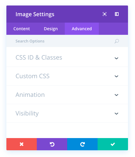
Image Advanced Options
Within the advanced tab, you will find options that more experienced web designers might find useful, such as custom CSS and HTML attributes. Here you can apply custom CSS to any of the module’s many elements. You can also apply custom CSS classes and IDs to the module, which can be used to customise the module within your child theme’s style.css file.
CSS ID
Enter an optional CSS ID to be used for this module. An ID can be used to create custom CSS styling, or to create links to particular sections of your page.
CSS Class
Enter optional CSS classes to be used for this module. A CSS class can be used to create custom CSS styling. You can add multiple classes, separated with a space. These classes can be used in your Divi Child Theme or within the Custom CSS that you add to your page or your website using the Divi Theme Options or Divi Builder Page Settings.
Custom CSS
Custom CSS can also be applied to the module and any of the module’s internal elements. Within the Custom CSS section, you will find a text field where you can add custom CSS directly to each element. CSS input into these settings are already wrapped within style tags, so you need only enter CSS rules separated by semicolons.
Animation
Use this dropdown menu to specify the lazy-loading animation for your image. You can choose for your image to fade in from the right, left, bottom, or top.
Visibility
This option lets you control which devices your module appears on. You can choose to disable your module on tablets, smart phones or desktop computers individually. This is useful if you want to use different modules on different devices, or if you want to simplify the mobile design by eliminating certain elements from the page.
Image Alt Text
Alternate text provides any necessary information if the image does not load, appear properly, or in any other situation where a user cannot view the image. It also allows the image to be read and recognised by search engines.